Record Auto Onderdelen
Record Auto Onderdelen
Record Auto Onderdelen
Record Auto Onderdelen
Record Auto Onderdelen
A wholesaler of car parts. Operating from the center of the Netherlands, Record Auto Onderdelen supplies their customers for over 35 years.
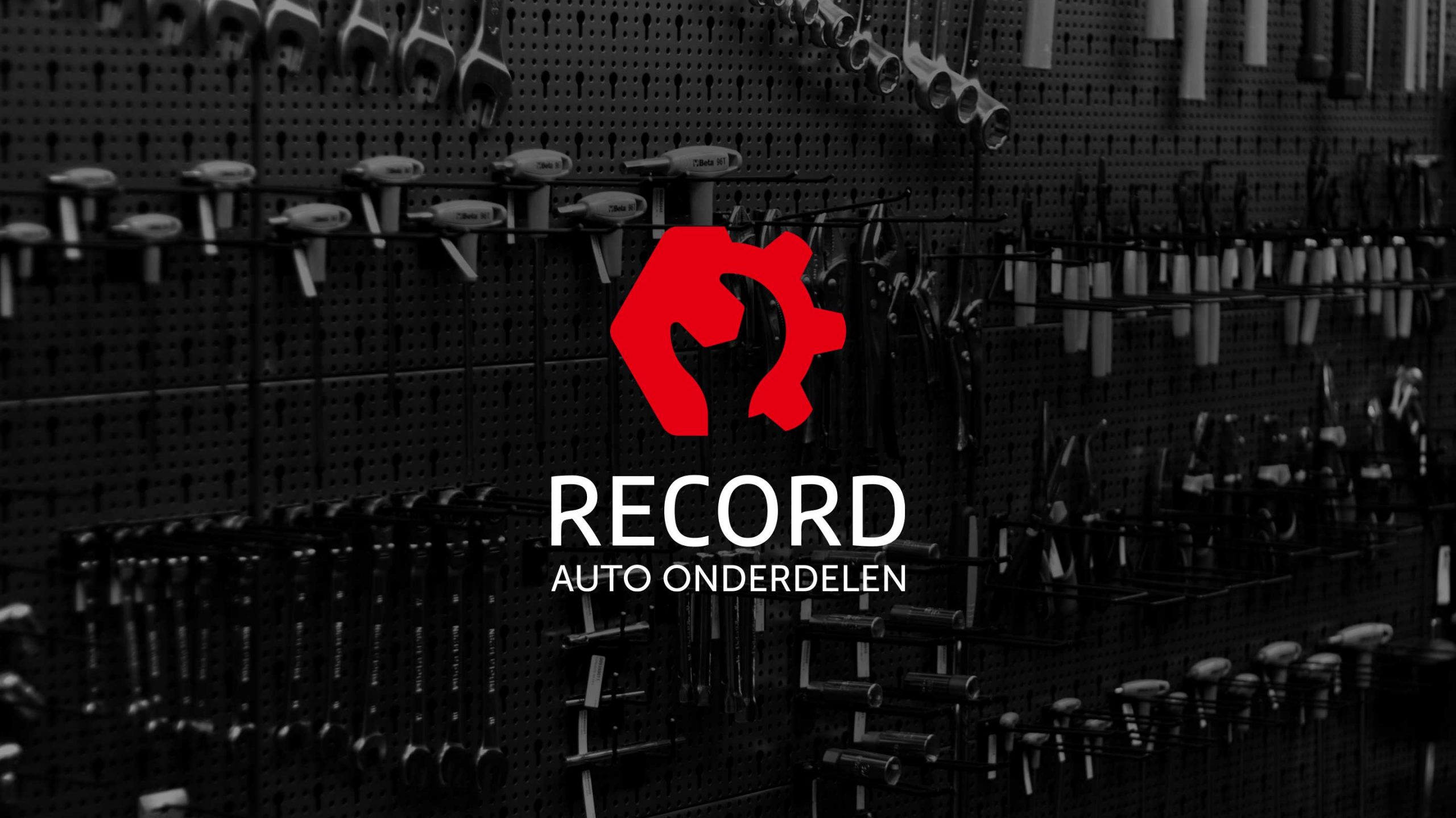
After 12 years it was time for something completely new. Shaping this, from logo to website, was a fantastic journey.
After 12 years it was time for something completely new. Shaping this, from logo to website, was a fantastic journey.
After 12 years it was time for something completely new. Shaping this, from logo to website, was a fantastic journey.
After 12 years it was time for something completely new. Shaping this, from logo to website, was a fantastic journey.
The problem
Give the current brand an epic update while reserving the core values. Over the years the company made a significant growth. Not only from a financial perspective, but also in terms of quality standards. Empowered by a new stakeholder it was the right time to translate this into a new corporate branding and a fresh website.
Give the current brand an epic update while reserving the core values. During the years the company made a significantly growth. Not only in hard numbers but also on quality standards. Empowered with a new stakeholder it was the right time to translate this with a new corporate branding and fresh website.
Give the current brand an epic update while reserving the core values. Over the years the company made a significant growth. Not only from a financial perspective, but also in terms of quality standards. Empowered by a new stakeholder it was the right time to translate this into a new corporate branding and a fresh website.
The solution
A completely revised visual brand identity. Unique, strong and memorable!
Year
2021
Year
2021
My role
Branding
Art direction
UX design
The Journey
Initially, the intention was to optimize the logo; take a closer look at the symbols, font and investigate whether the logo could be more balanced.
Not quite yet...
While optimizing the symbols and looking for a new solution it became clear to me that the results weren’t quite yet the outcome I was looking for…
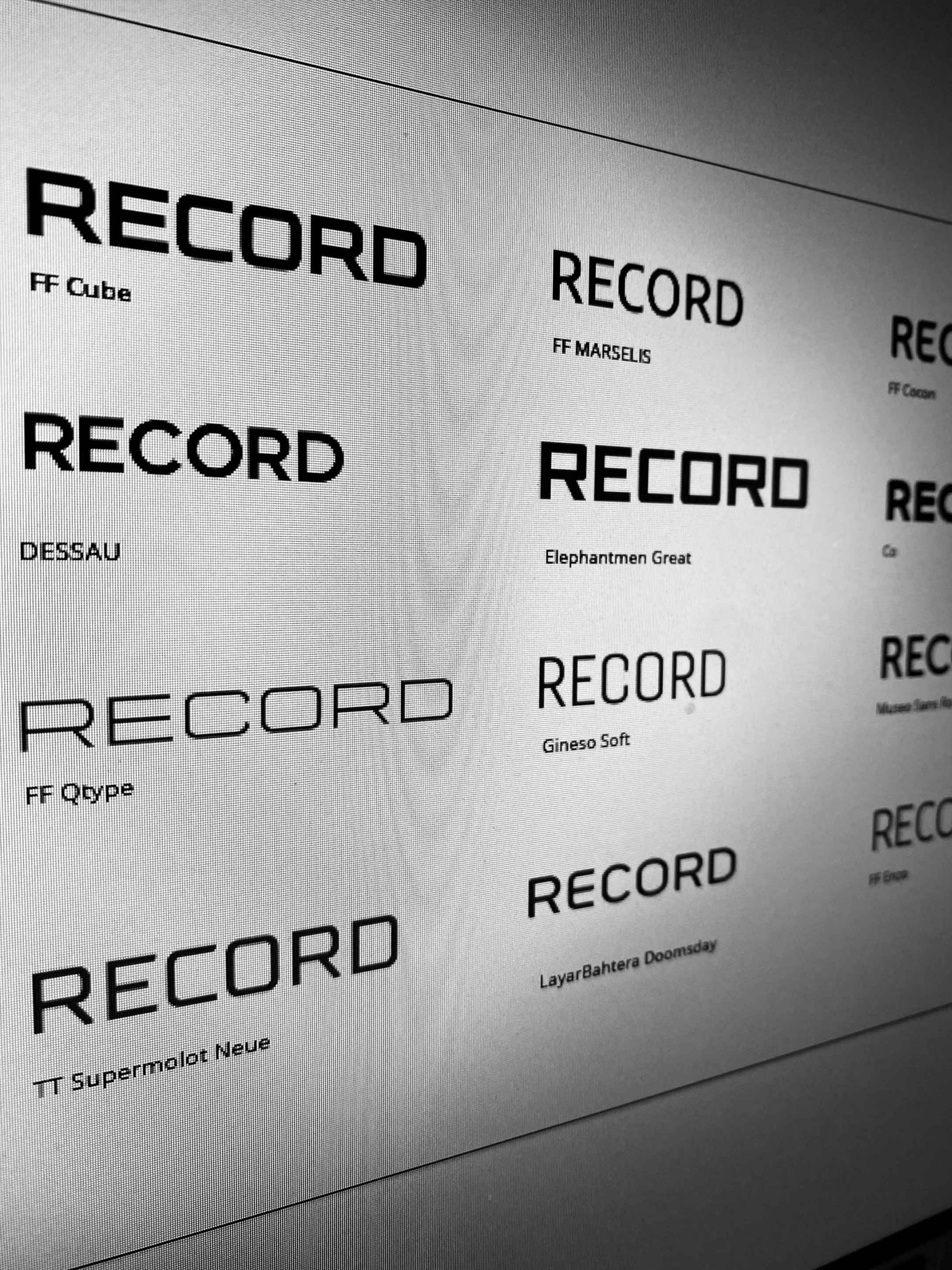
Let's rethink
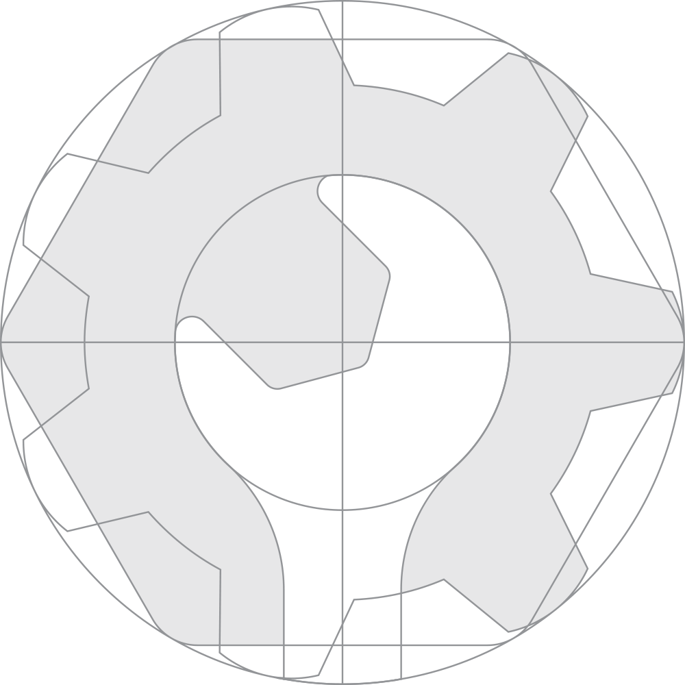
A new idea arose. Could I make something new out of the three current symbols? It was worth a try...
New versus old symbols
Honour the past
After exploring various alternatives there was one option that was really spot on. The hard work finally payed off.
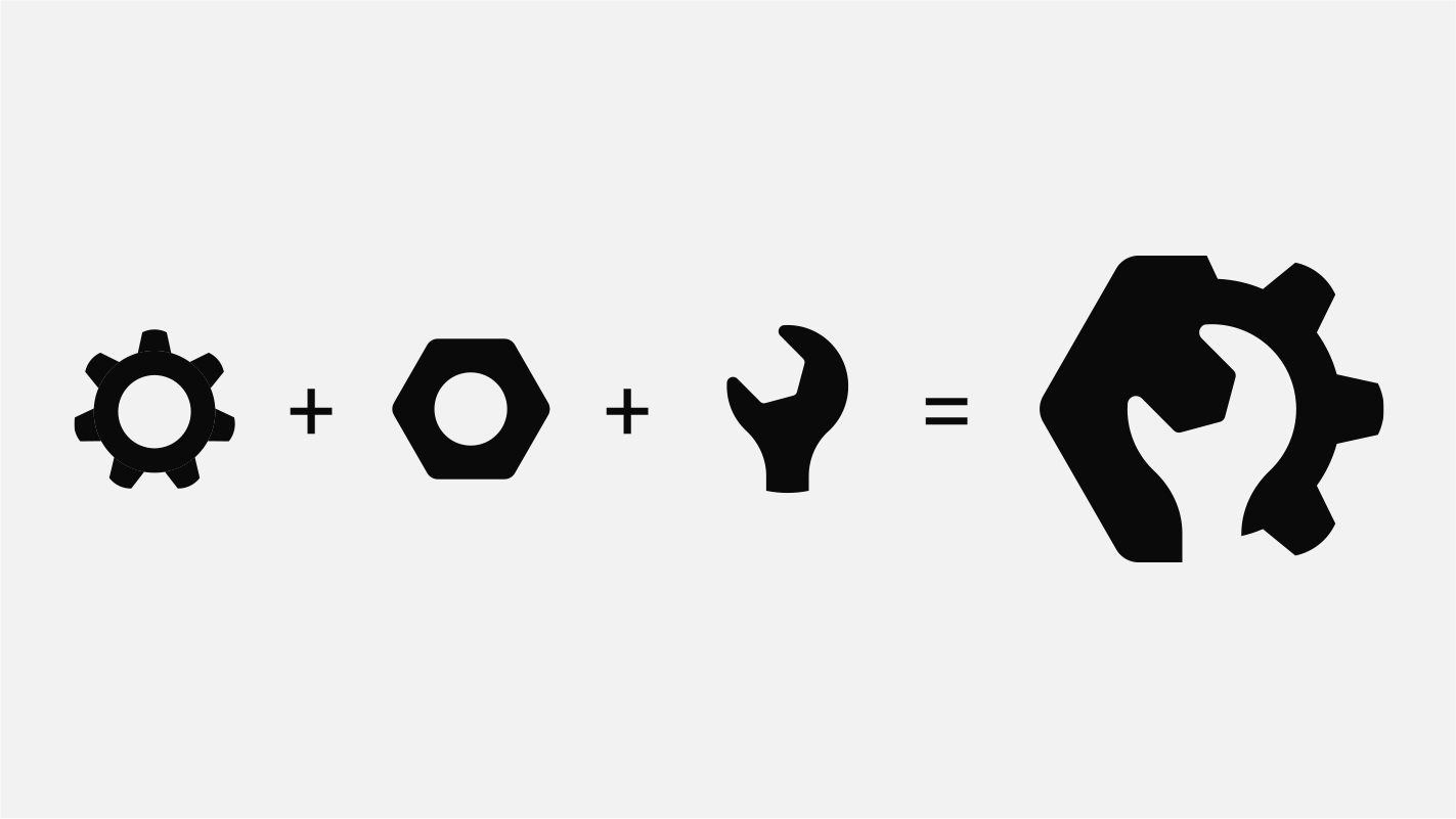
The result
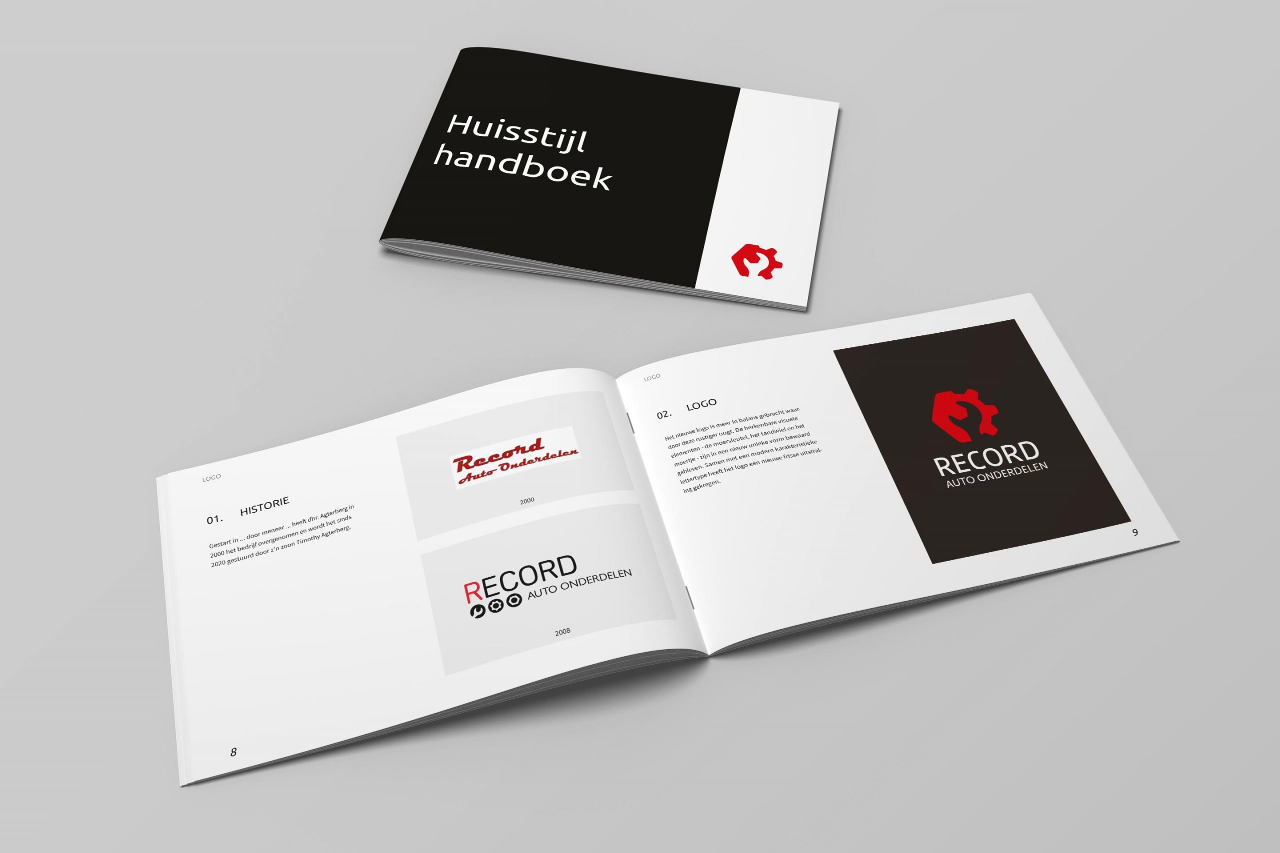
A new logo that takes its origin into account. Although the logo has clearly got a make-over, the link to its strong roots is still represented.
Branding
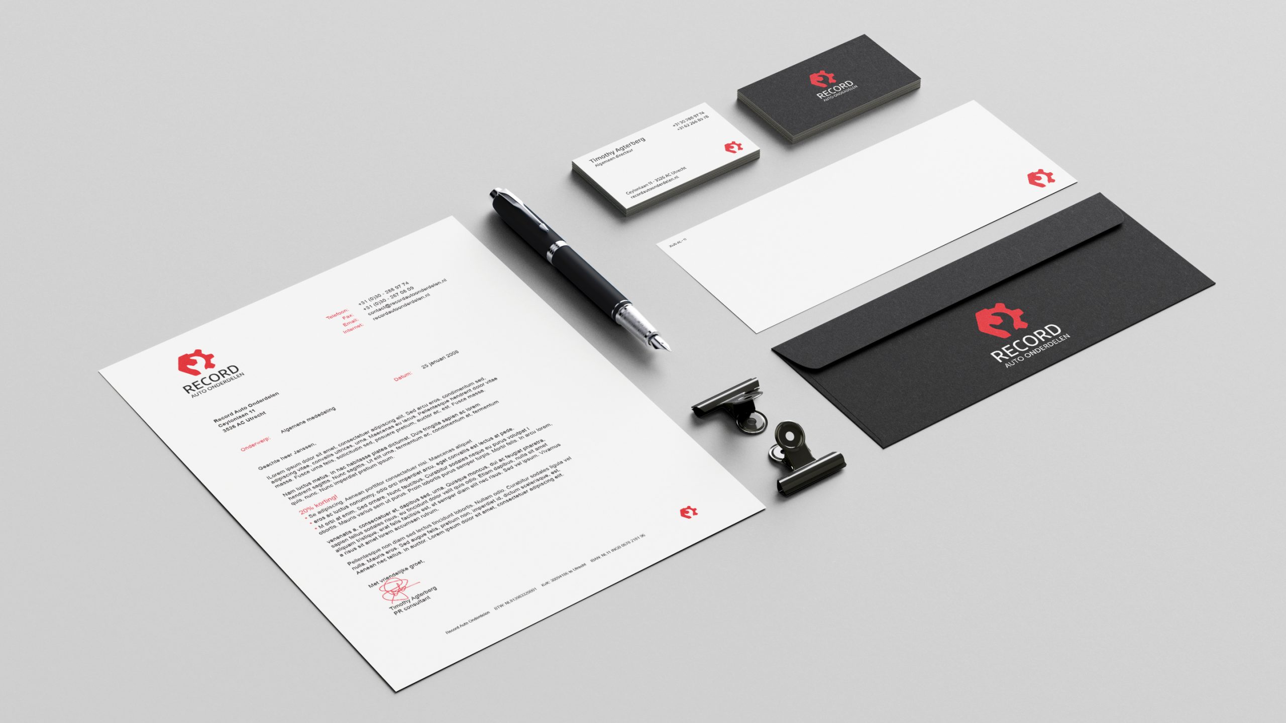
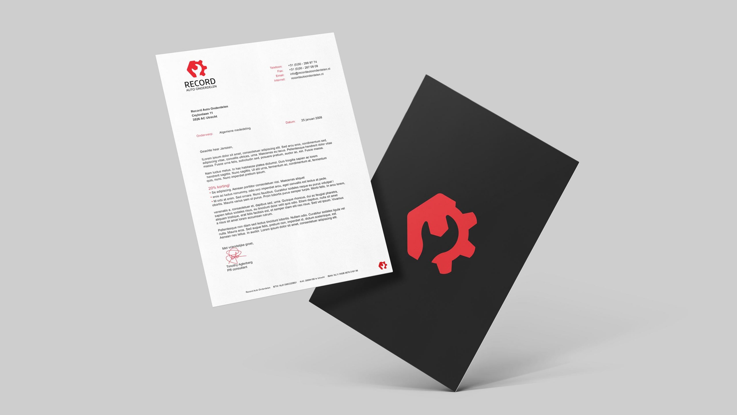
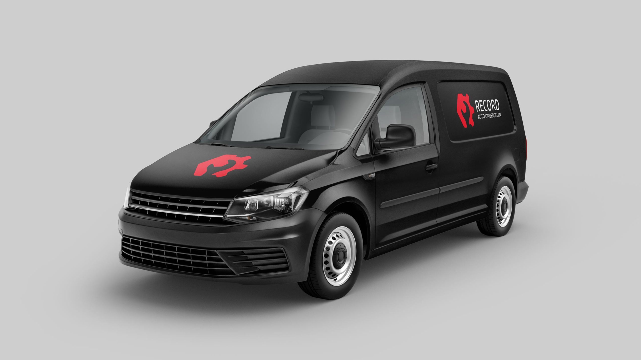
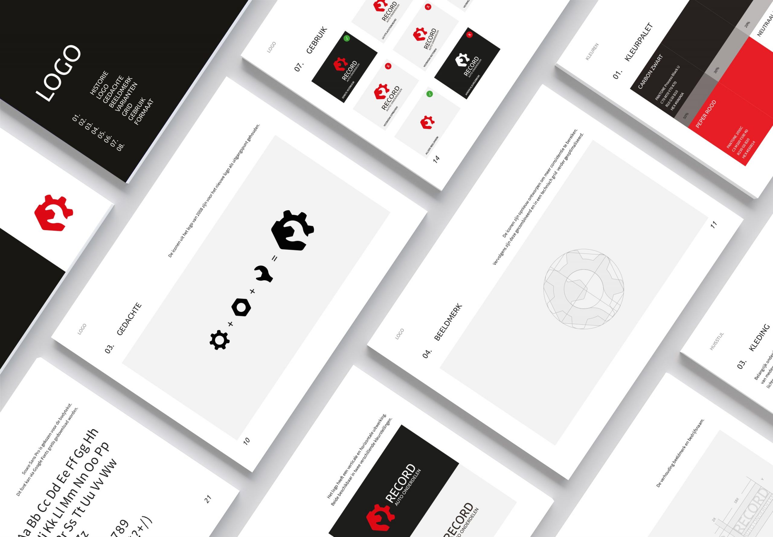
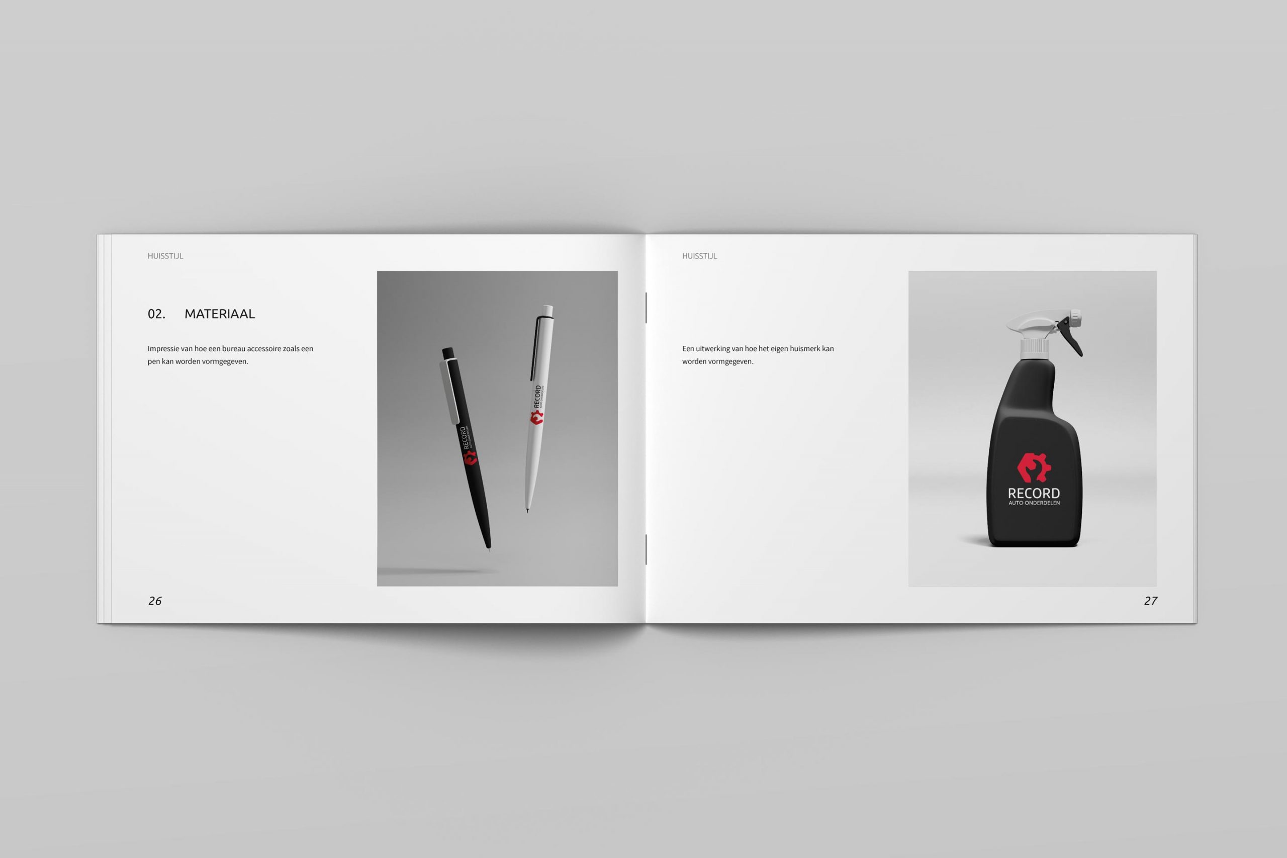
After optimizing the logo the next step was to think about and create the visual identity. Starting with a distinguished branding stationery.
Shape it, define it
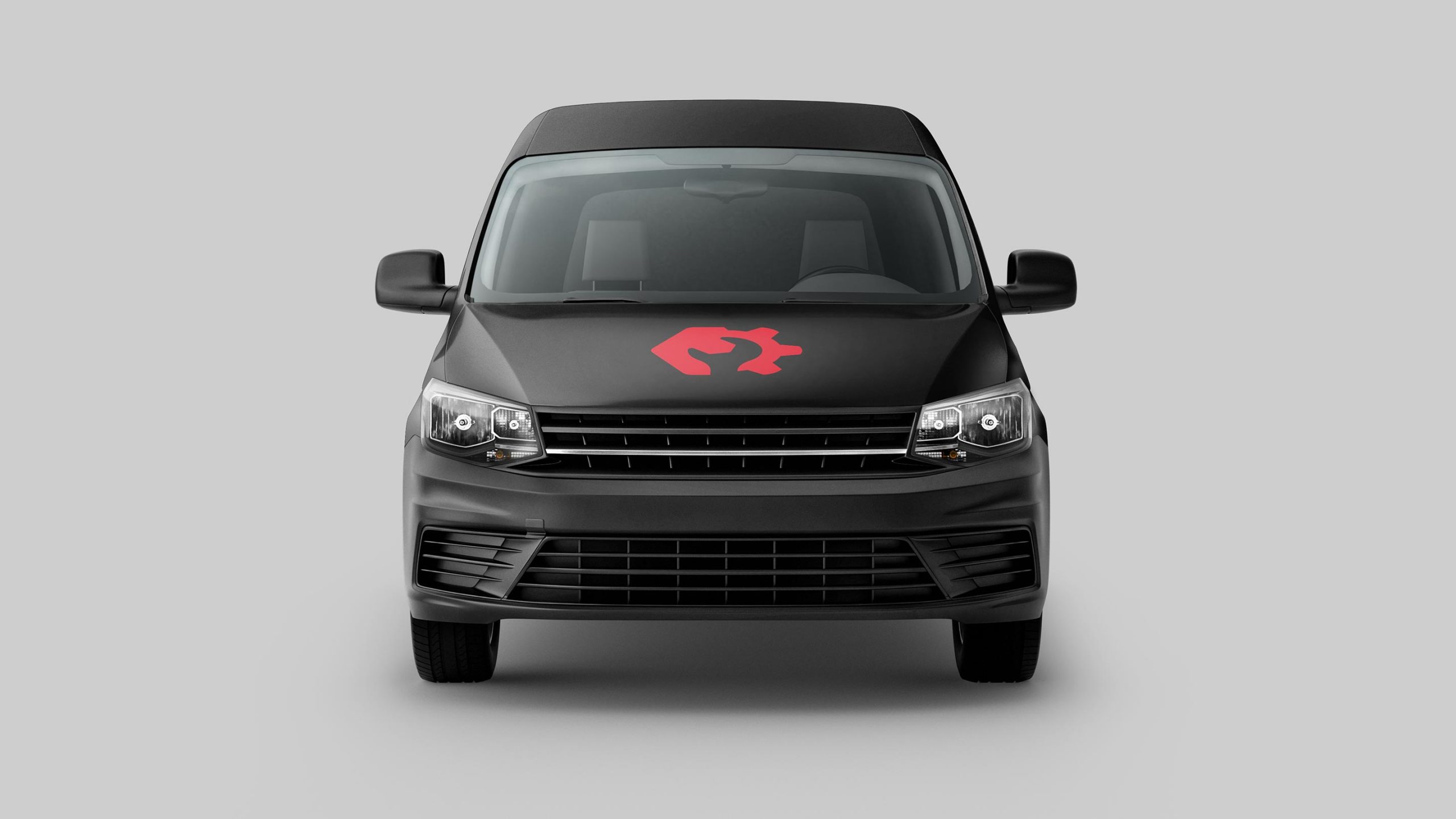
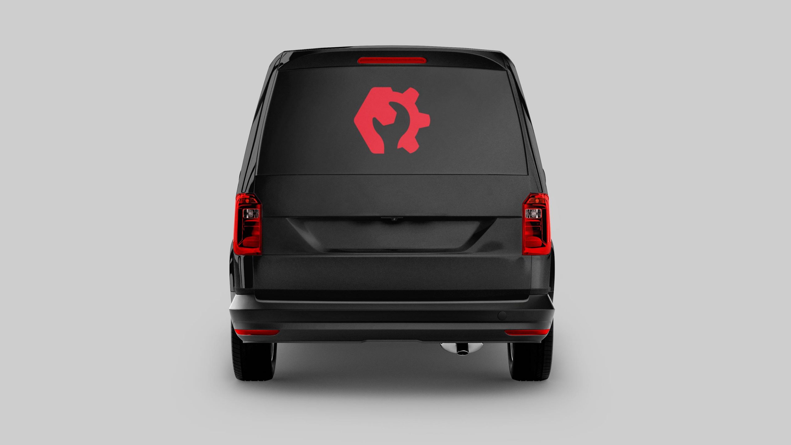
After all the designs - from business card to car decals - were finalized I was ready for setting up the brand guidelines.
Interactive wireframe
Which direction should we go? Together with the client a plan was set up. First step was to sketch the idea before making a high fidelity wireframe.
Positioning content
HF wireframe
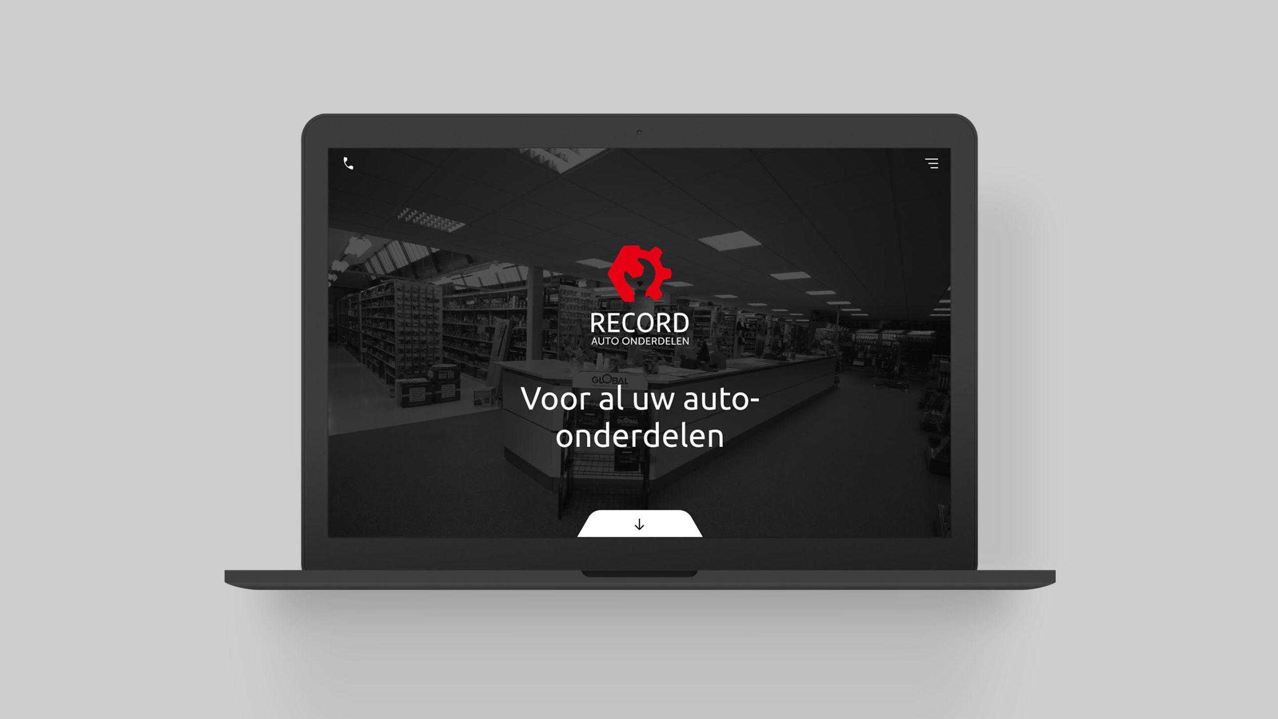
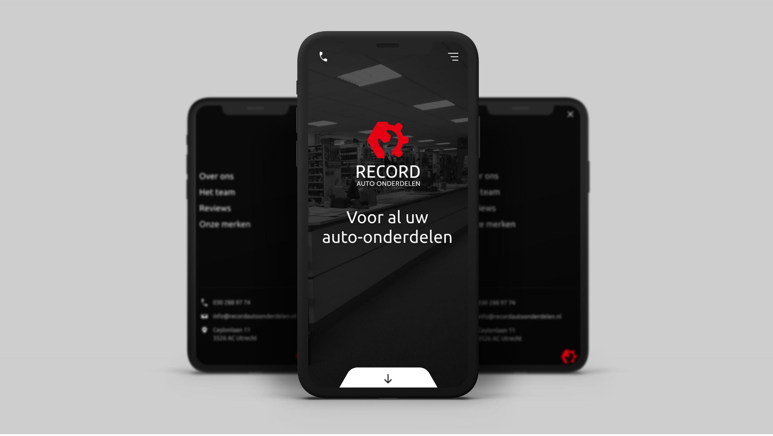
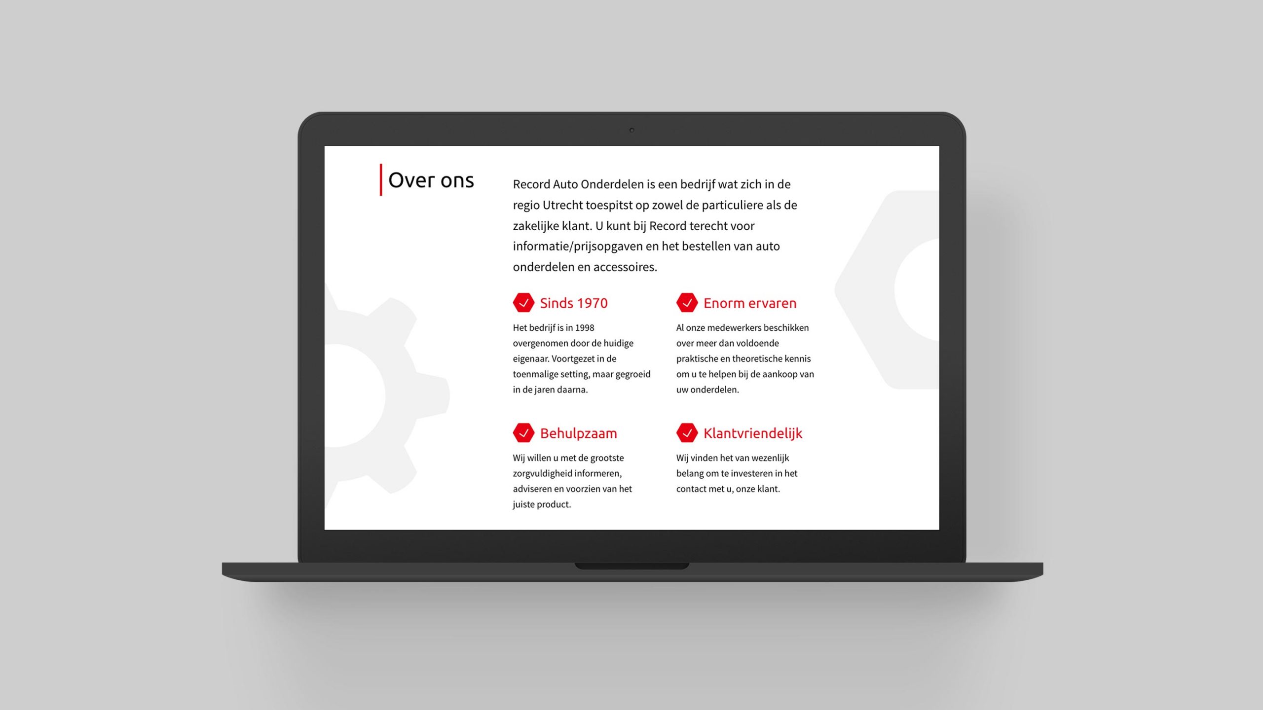
Website
On the new website simplicity is the key for success. With a strong focus on typography and layout enriched with (micro)animations to improve the user experience.
Learnings
Don’t be afraid to deviate from your initial plan…
If I look back at the process. The initial thought of updating the current logo with a few minor tweaks wasn't working. Realizing that and then actually taking the step to act accordingly takes a certain courage. It proved me again that a creative person doesn't have to be afraid to fail, but it enables you to learn from the process instead.
Next case
Baptist Arnhem
UX Design
Helping Baptist with a better user experience for their online customers.